
BRAND IDENTITY | STRATEGY | ART DIRECTION
Neo-Temaki
The client tasked us to design a contemporary Japanese handroll concept designed for a young, culture-driven audience in Dubai.
CLIENT
JW Marriott Marquis Dubai
YEAR
2026
AGENCY
Satellite Samurai
ROLE
Brand Designer
The Brief
Neo-Temaki came to me as more than a restaurant branding project. The ambition was to create a brand that could live comfortably between hospitality and culture, a place where people would visit as much for the atmosphere as they would for the food.
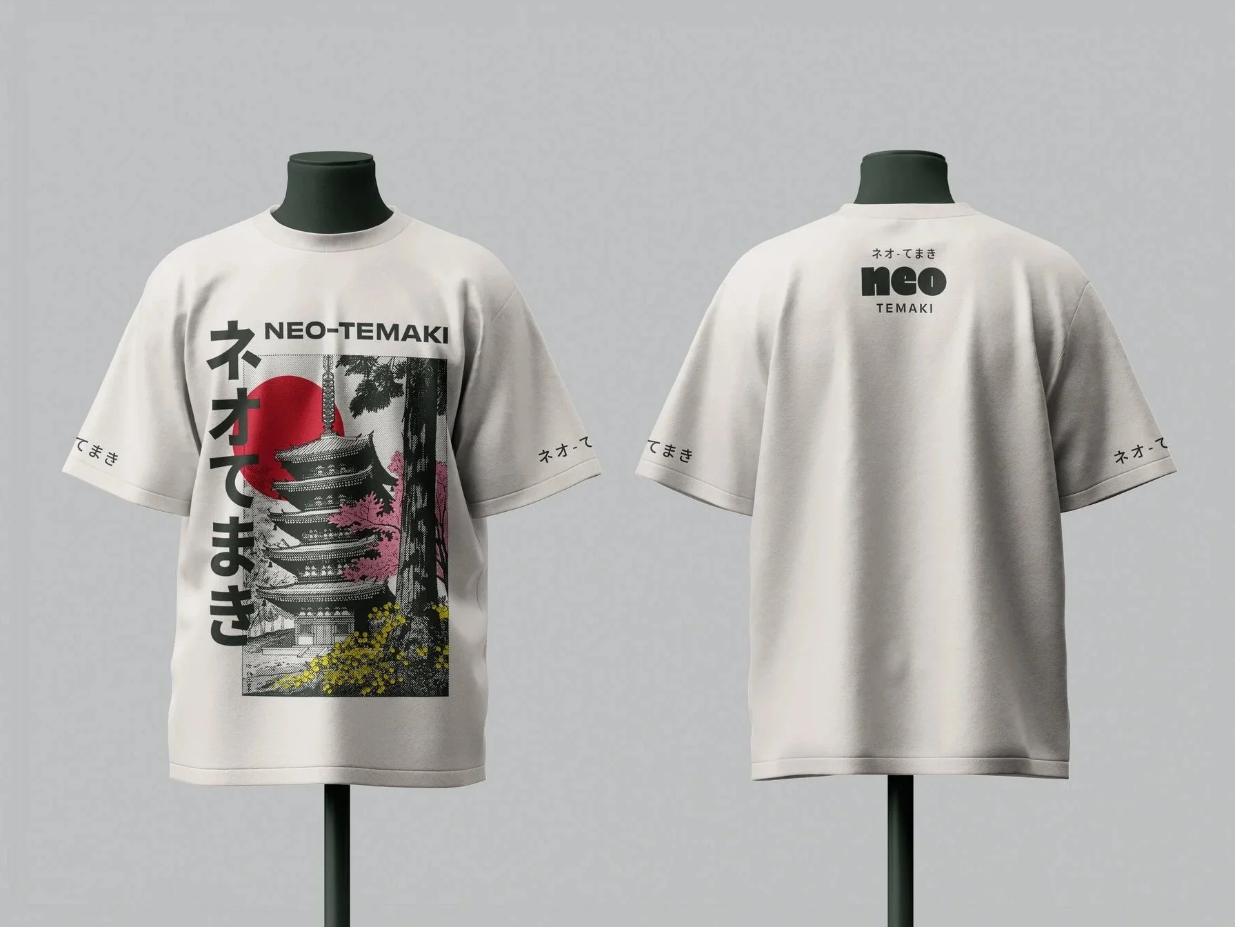
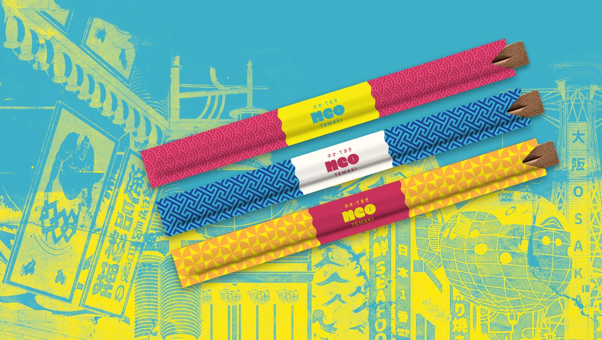
The concept drew inspiration from Tokyo’s street culture, but it needed to feel authentic in Dubai’s creative scene. My role was to translate that idea into a visual identity system that could scale across digital, print, environmental graphics, and future brand applications.
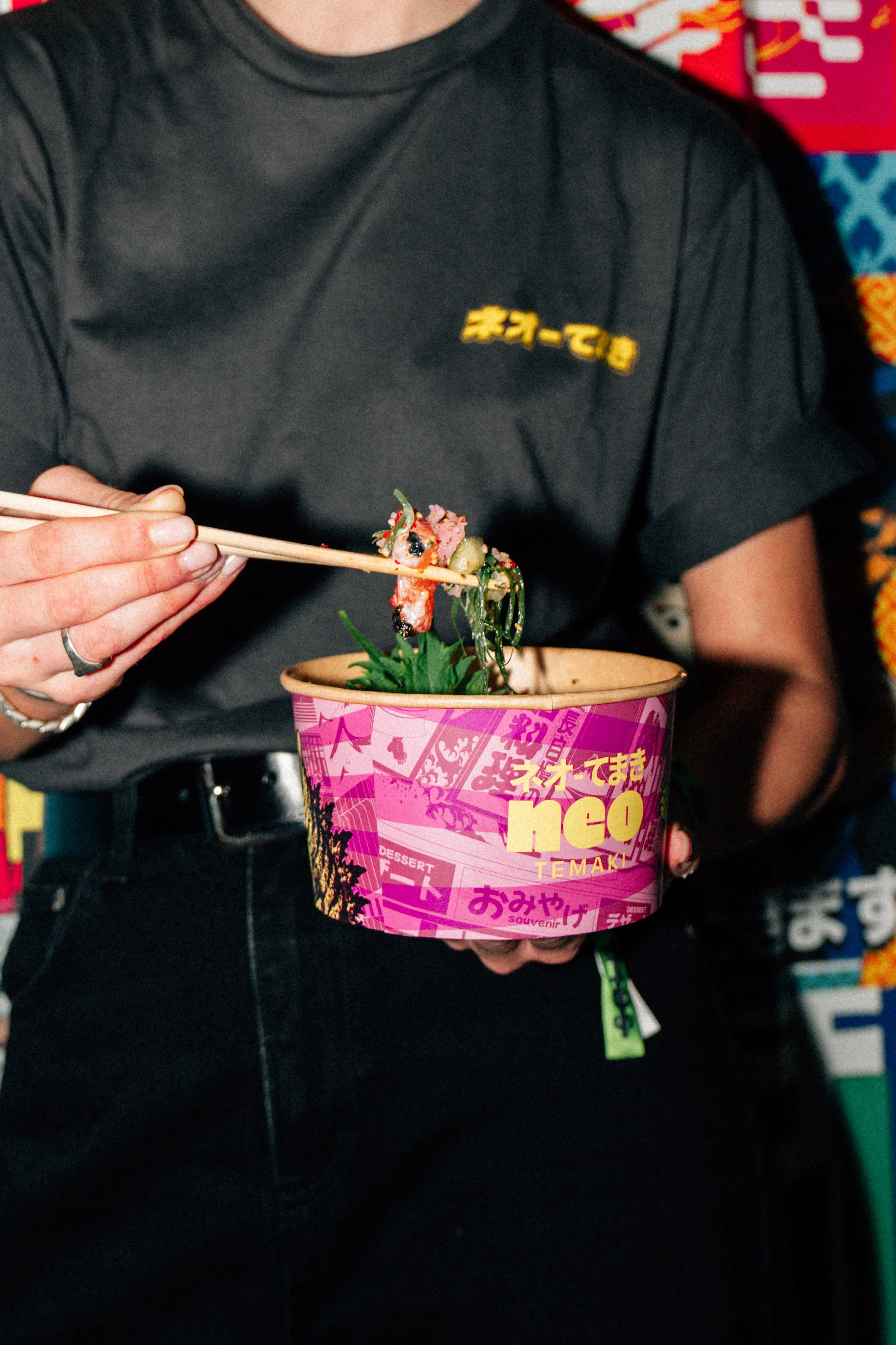
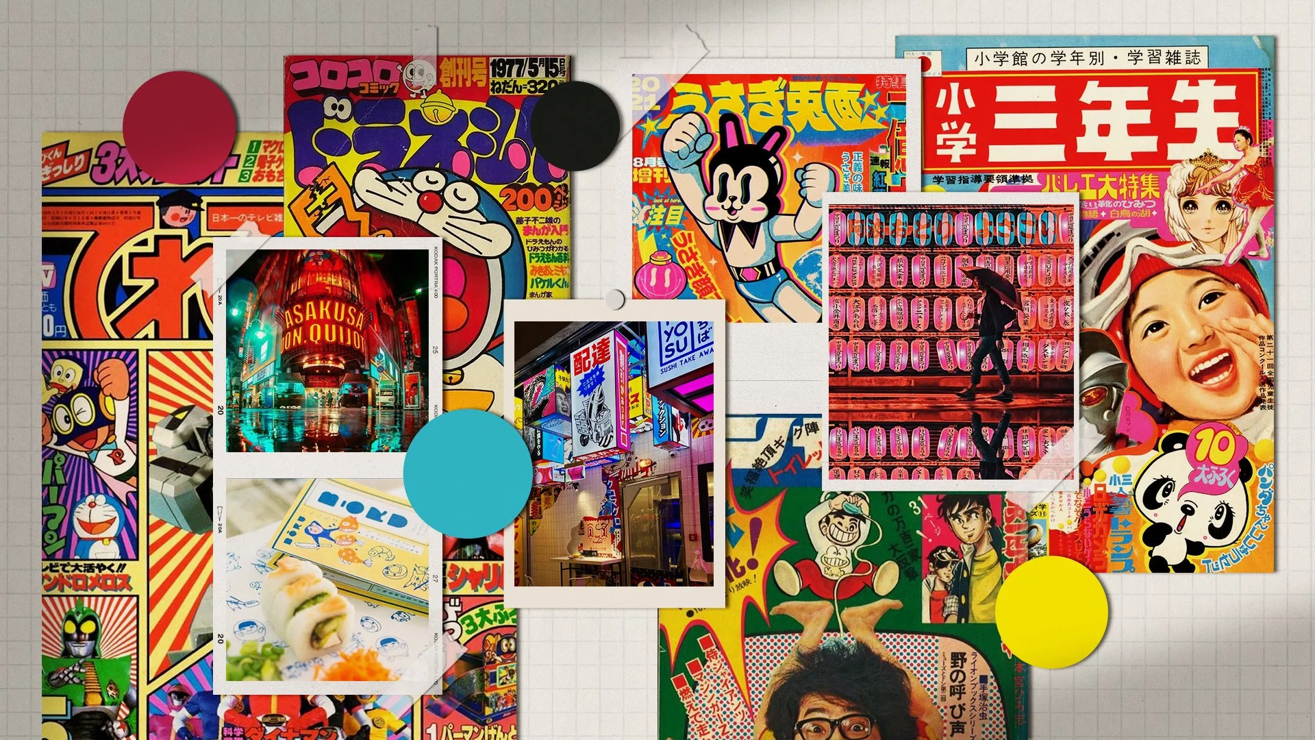
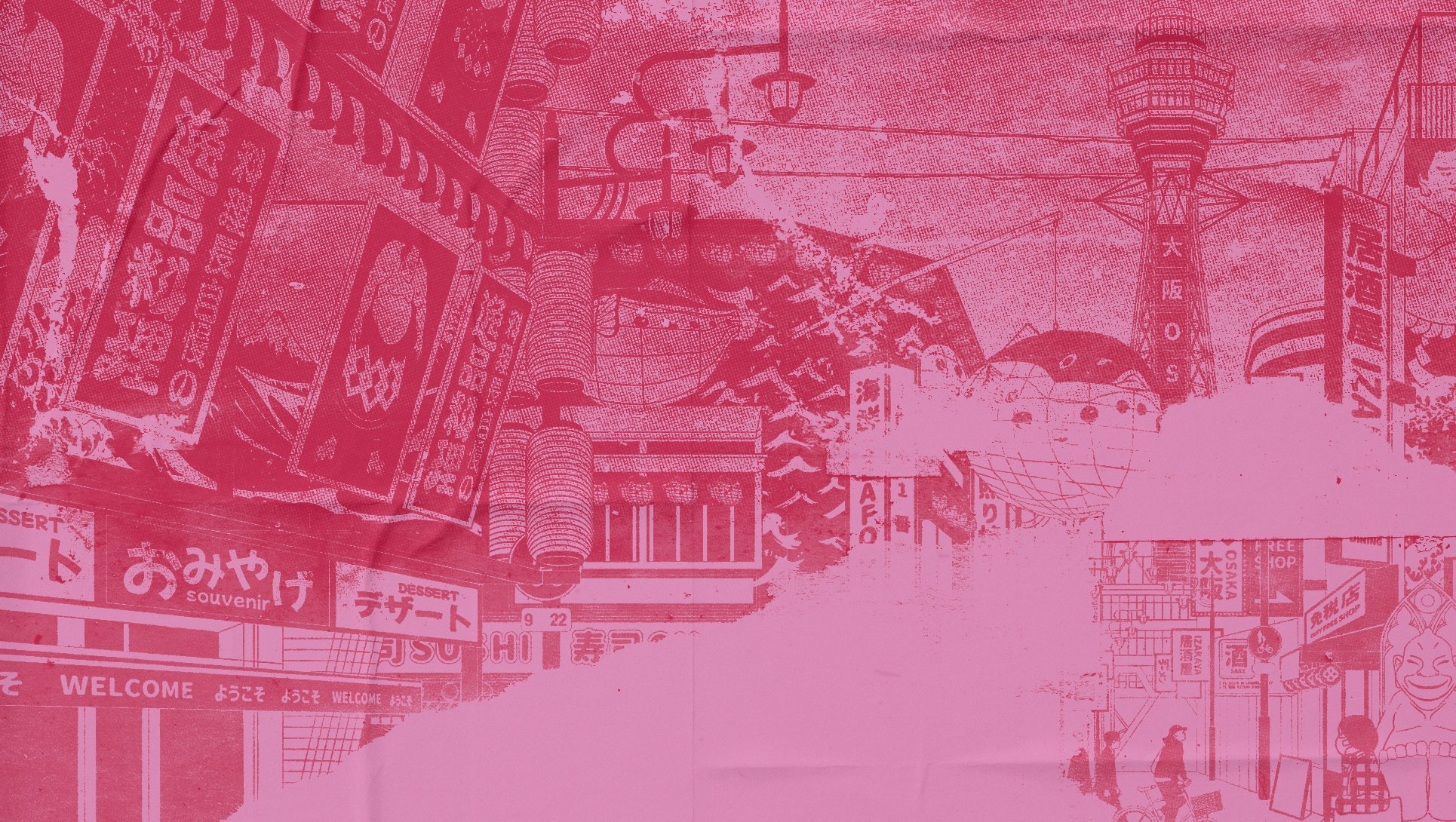
Moodboard presented to client during initial design phase
Starting with the Right Problem
When I begin branding projects, I rarely think about logos first. Instead, I ask a simple question:
“What should people feel before they even interact with the product?”
For Neo-Temaki, I didn’t want the brand to feel like another minimalist Japanese restaurant. There are already plenty of brands that communicate precision through restraint.
This one needed movement. It needed energy.
It needed to feel alive, as energetic and vibrant as Tokyo, where food, music, fashion, and people all exist in the same conversation.
This became the foundation of every design decision that followed.
Designing the Personality Before the Identity.
Once the direction became clear, I started defining the personality of the brand. Rather than describing Neo-Temaki through food alone, I focused on behaviors.
How does the brand speak? How does it move? What kind of people would naturally be drawn to it?
Answering those questions helped establish the brand pillars, narrative, audience, and voice before moving into visual design. Instead of becoming separate strategy documents, these became practical creative constraints that informed every visual decision later in the project.

Building a Visual System
With the brand personality established, the visual system became an exercise balancing contrast. I wanted the identity to feel deeply rooted in Japanese culture without leaning on familiar cliches or minimalist restaurant branding.
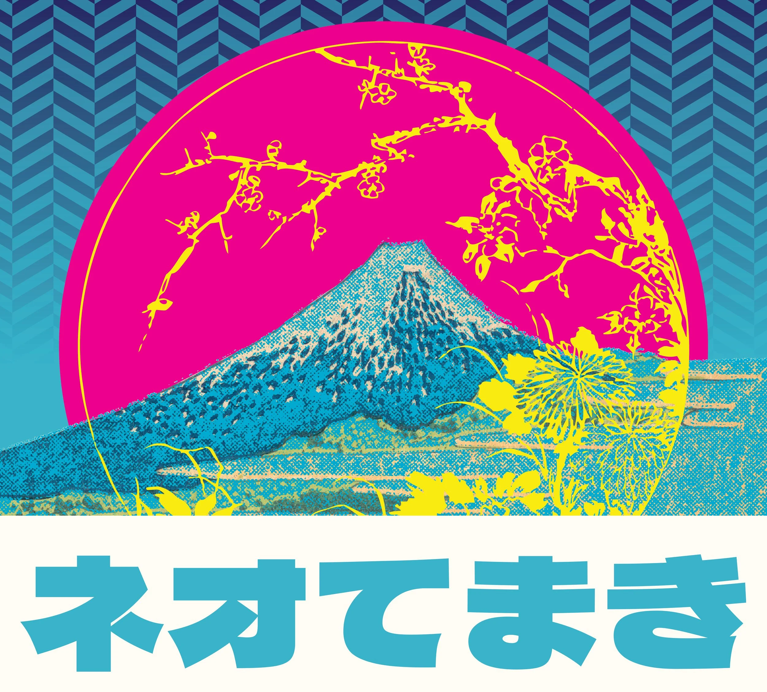
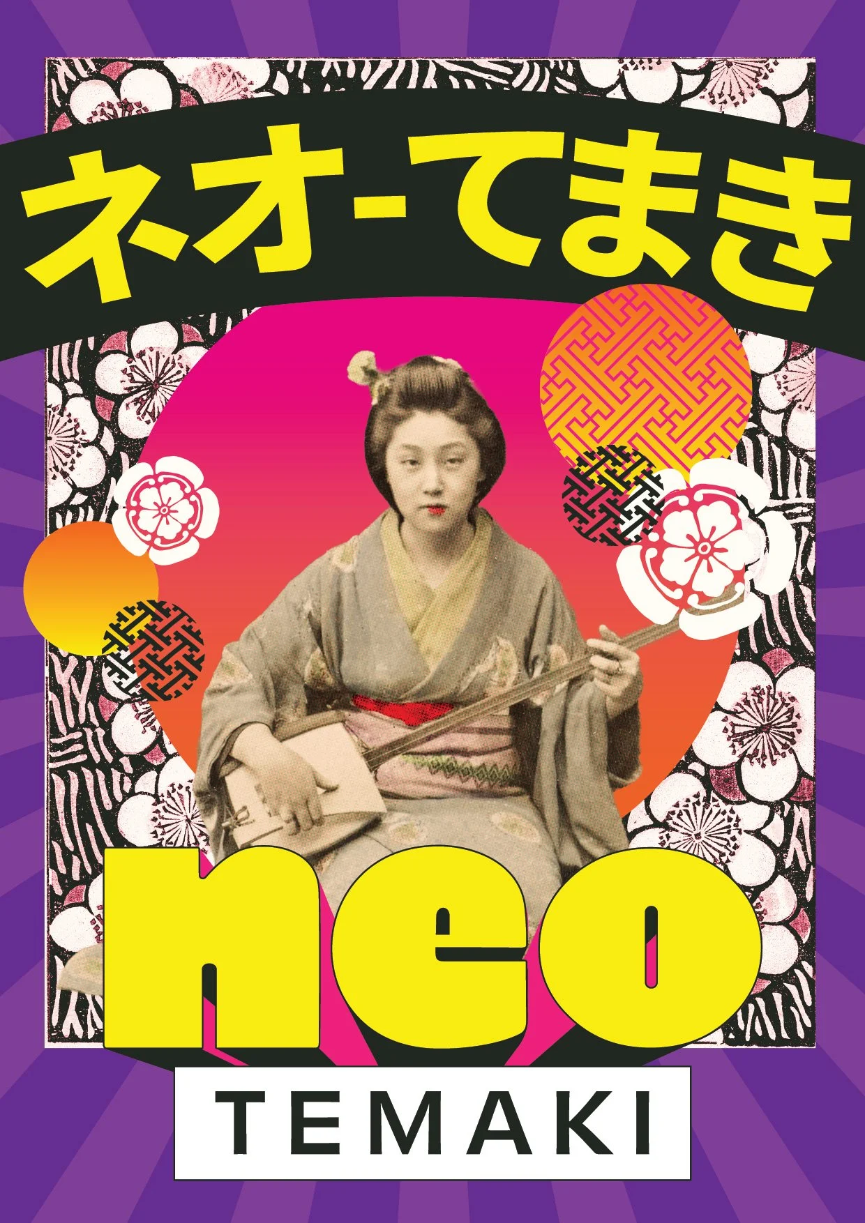
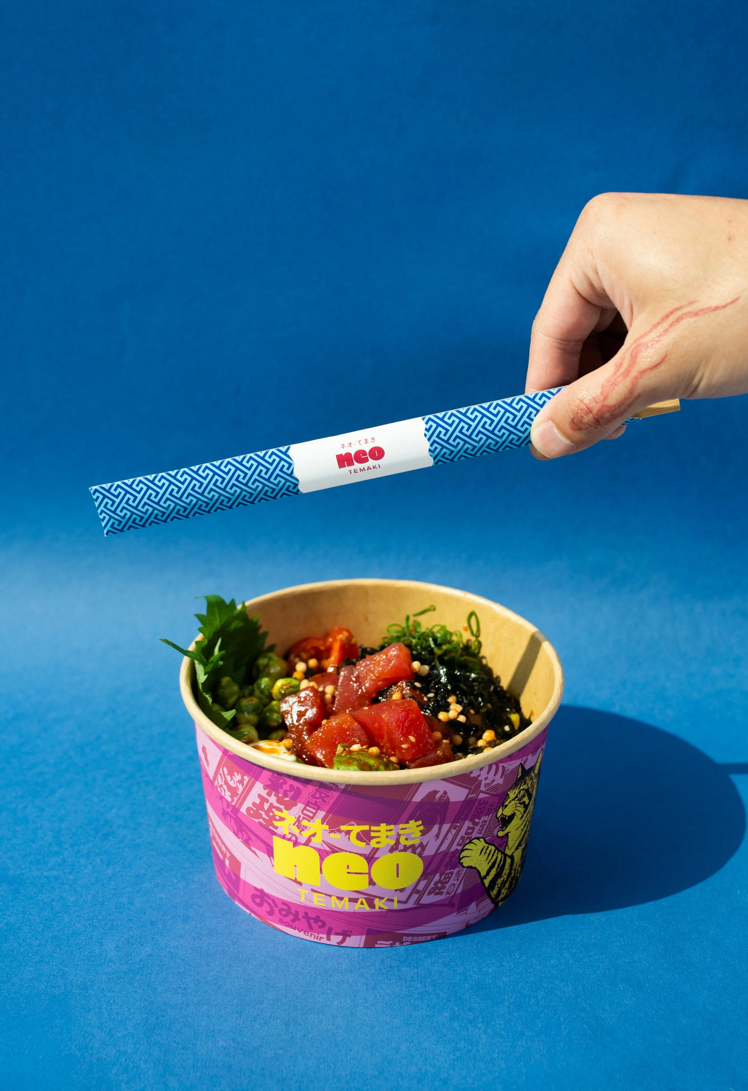
The logotype mixes Katakana and Hiragana, creating a typographic gesture that feels both authentic and contemporary.
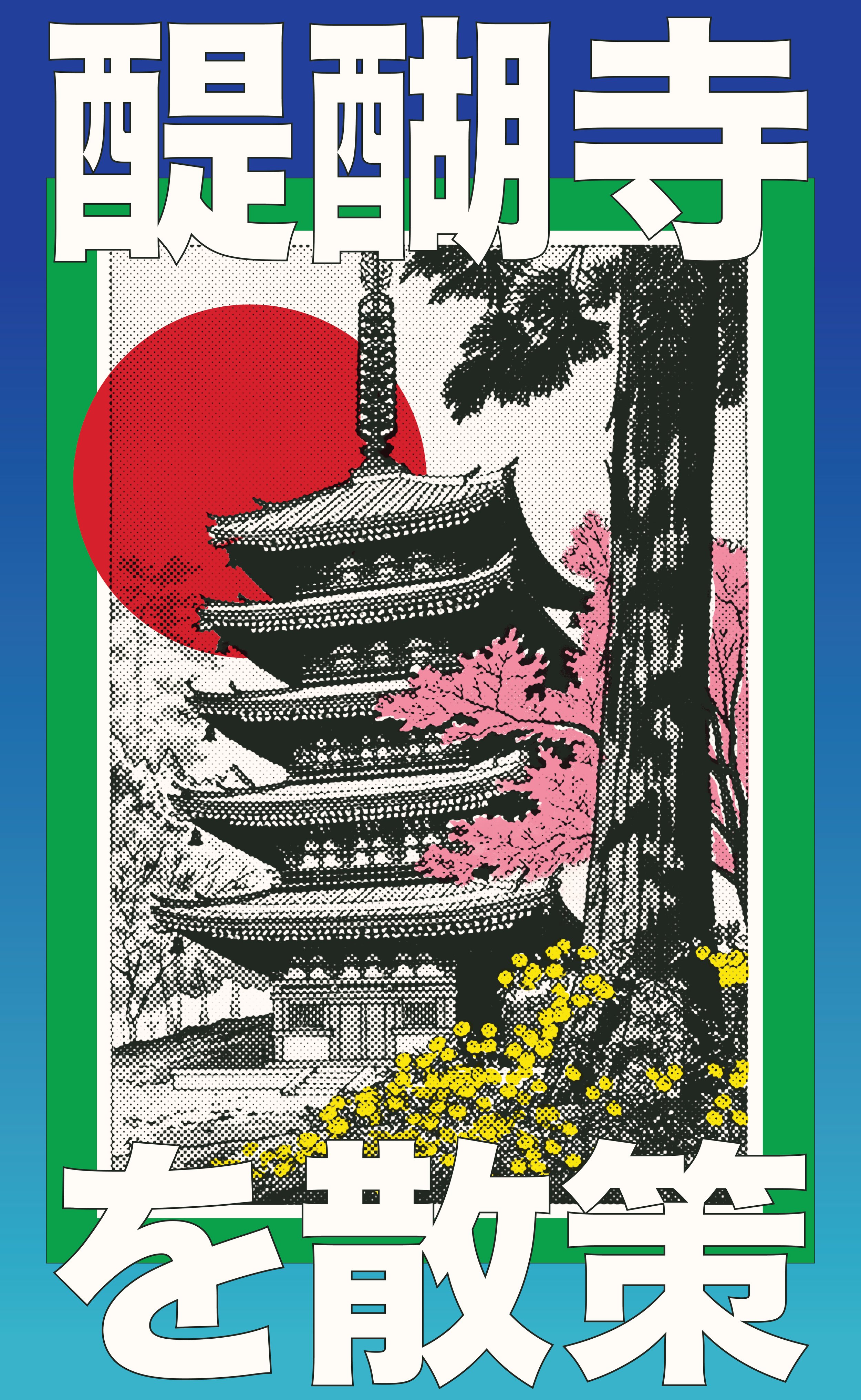
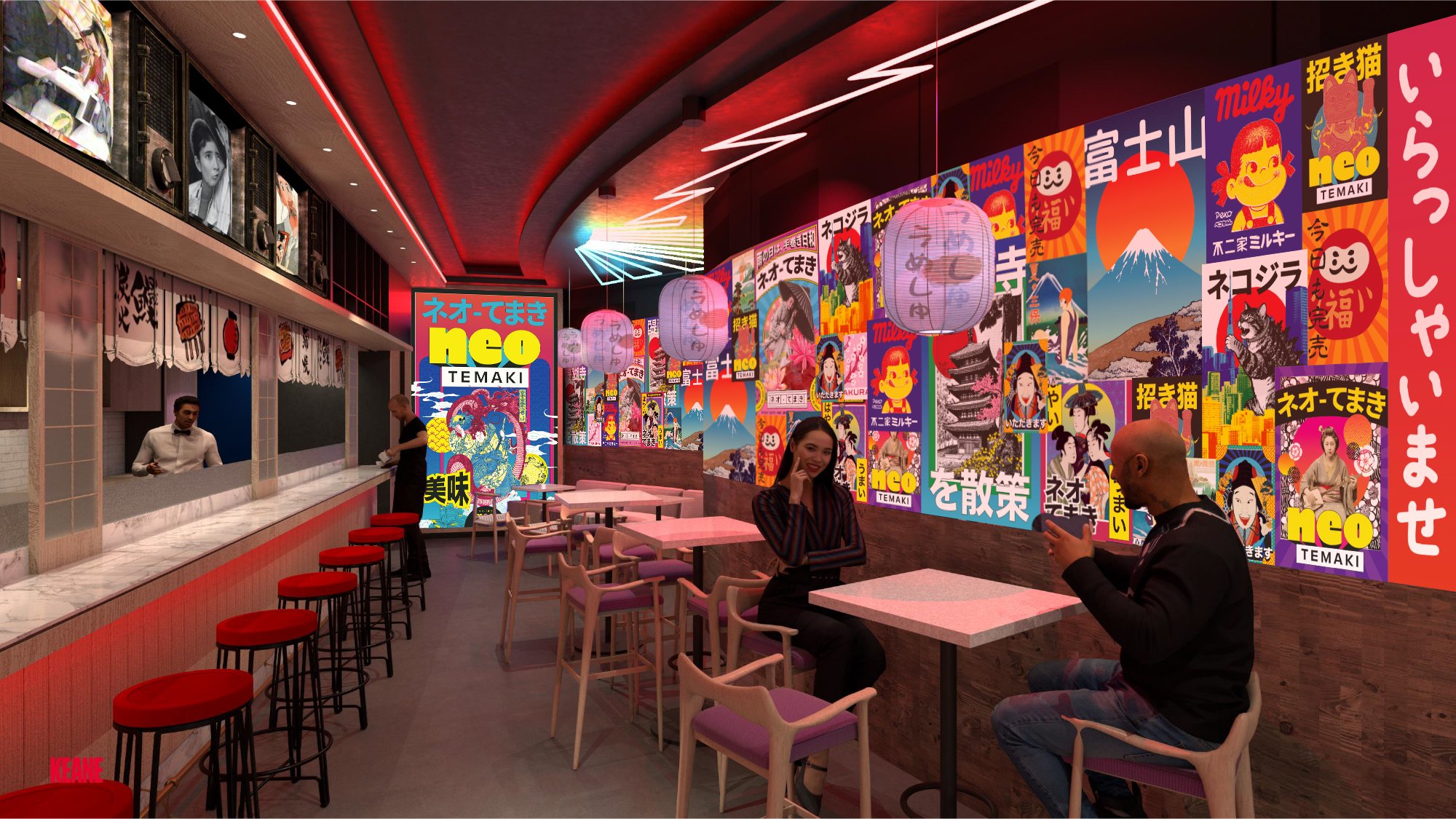
The brand is also maximalist. From there, the graphic language evolved by blending traditional Japanese motifs with bold colours, layered compositions, and pop art sensibilities inspired by Tadanori Yokoo.
Rather than recreating vintage Japanese design, the goal was to reinterpret it for a new generation, one that moves fluidly between food, fashion, music, and digital culture.
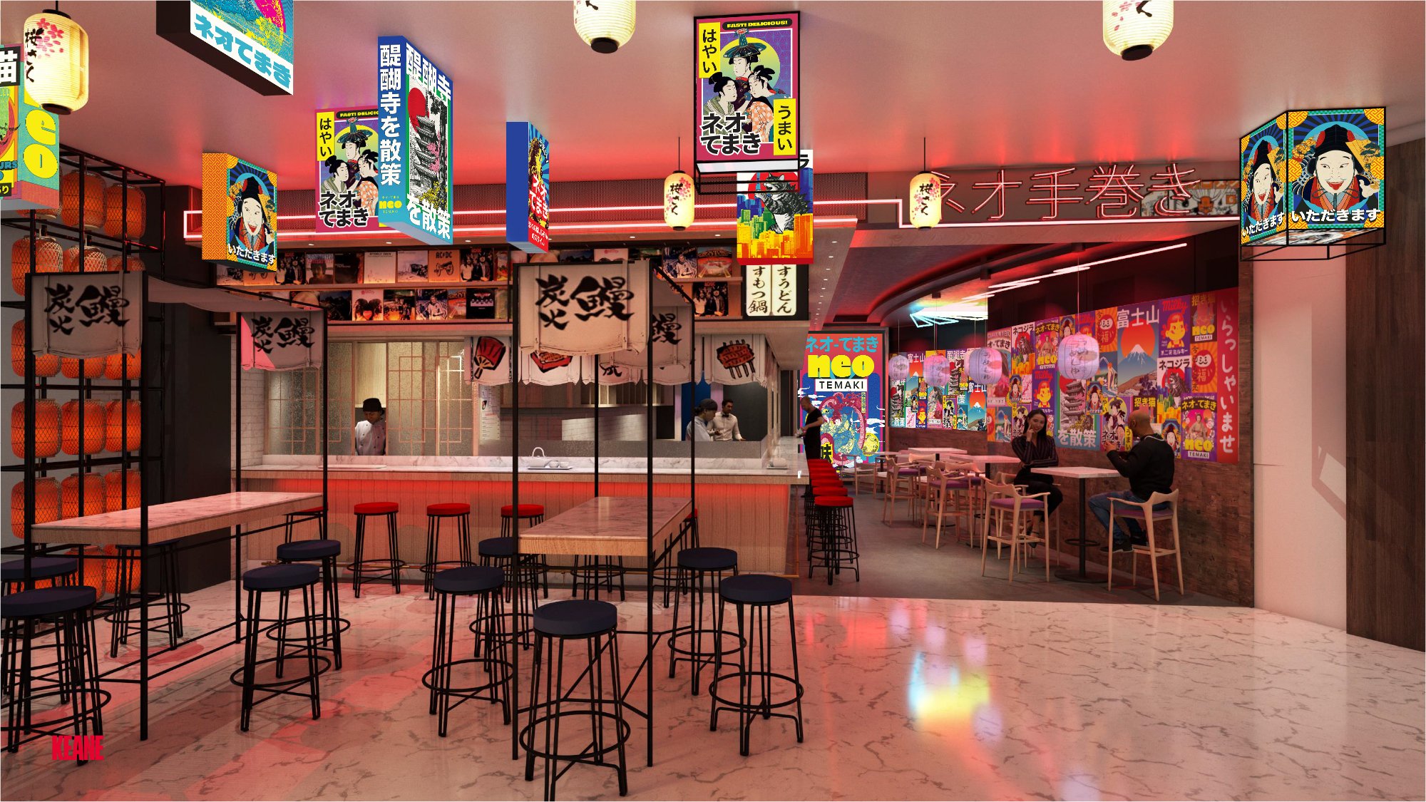
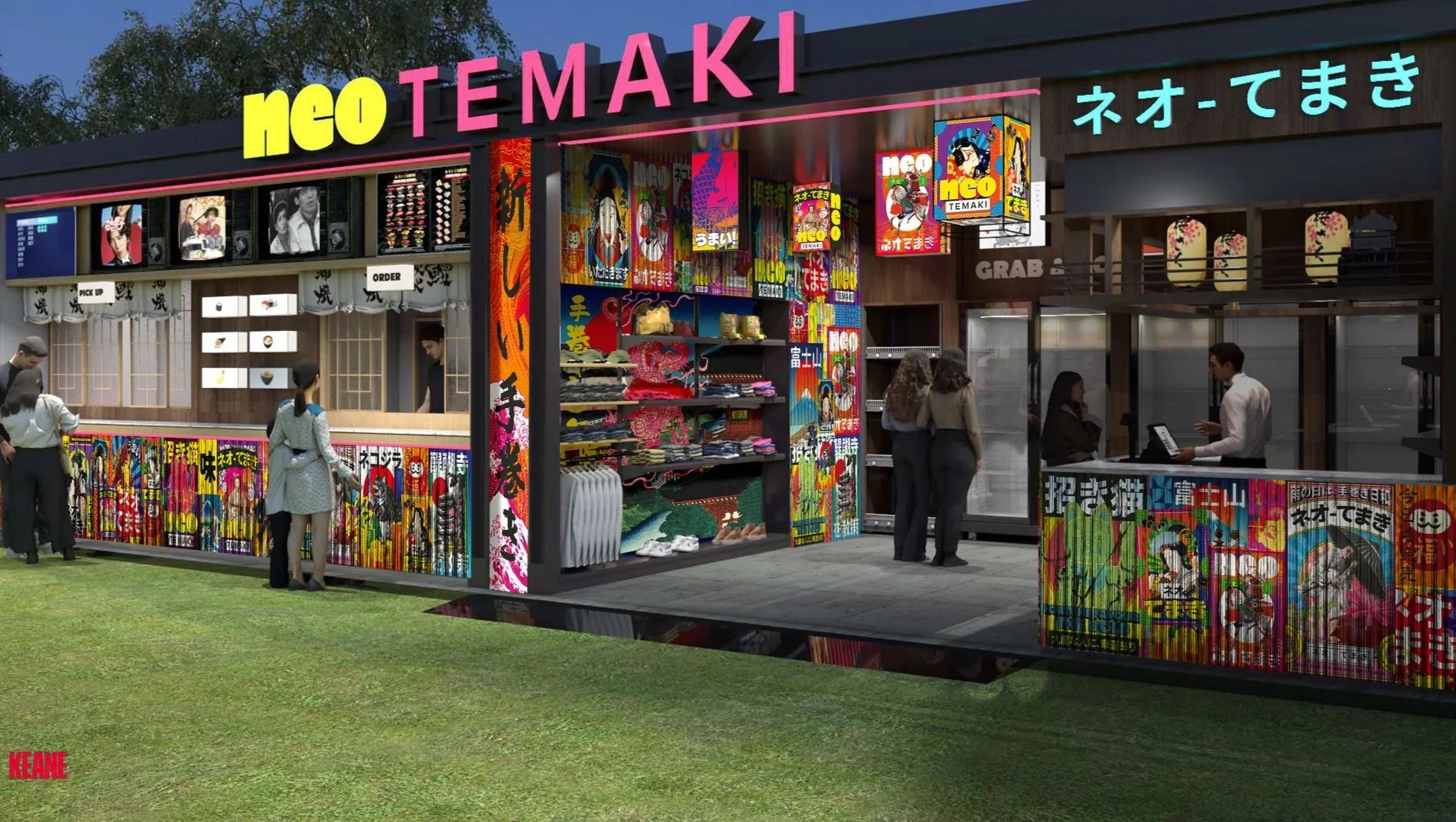
Mockups of the posters and wall art for Neo-Temaki’s home venue and SOLE DXB pop-up.

CREDITS
Brand Designer - Nica Galvez
Account Manager - Loise Austria-Paraiso
Additional Designs - Rusdee Bolante
Interior Design - Keane
Content Photography - Social Studio ME