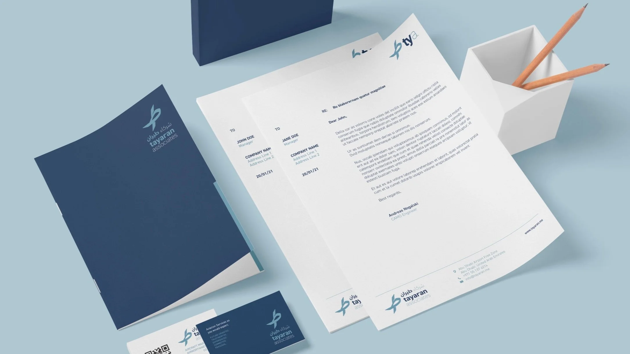
CORPORATE IDENTITY
Tayaran Associates
I was hired to design the logo and visual identity for an aircraft maintenance firm in Abu Dhabi. The client wanted a corporate identity that exuded professionalism, trust-worthiness, and expertise.
CLIENT
Tayaran Associates
YEAR
2021
AGENCY
Freelance
ROLE
Brand Designer

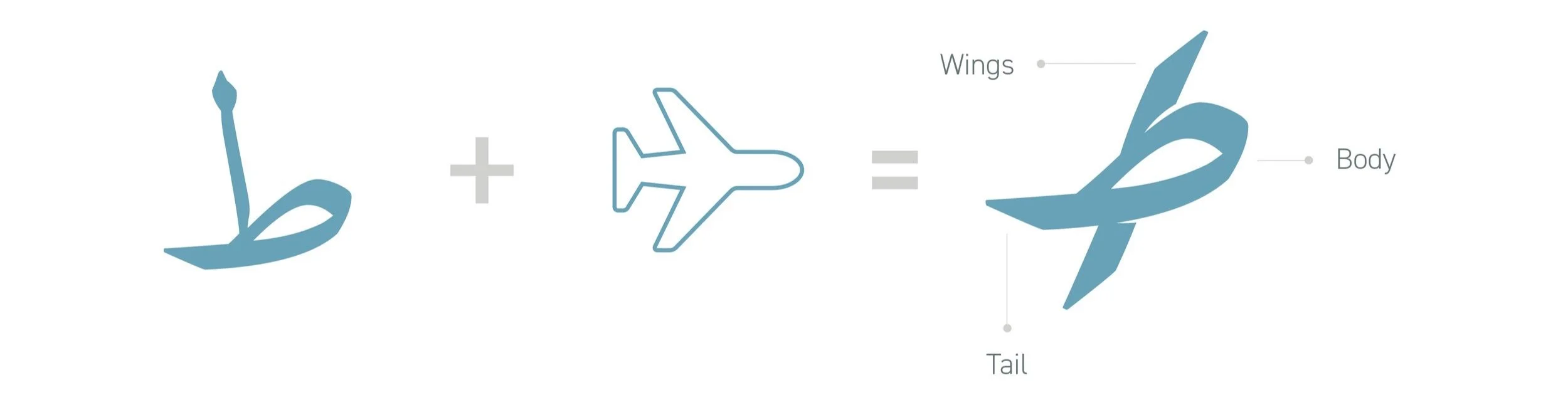
The Icon
Tayaran means ‘flight’ in Arabic.
The icon is a play on the word’s first letter, the Arabic ‘taa’ designed to look like a soaring aircraft.
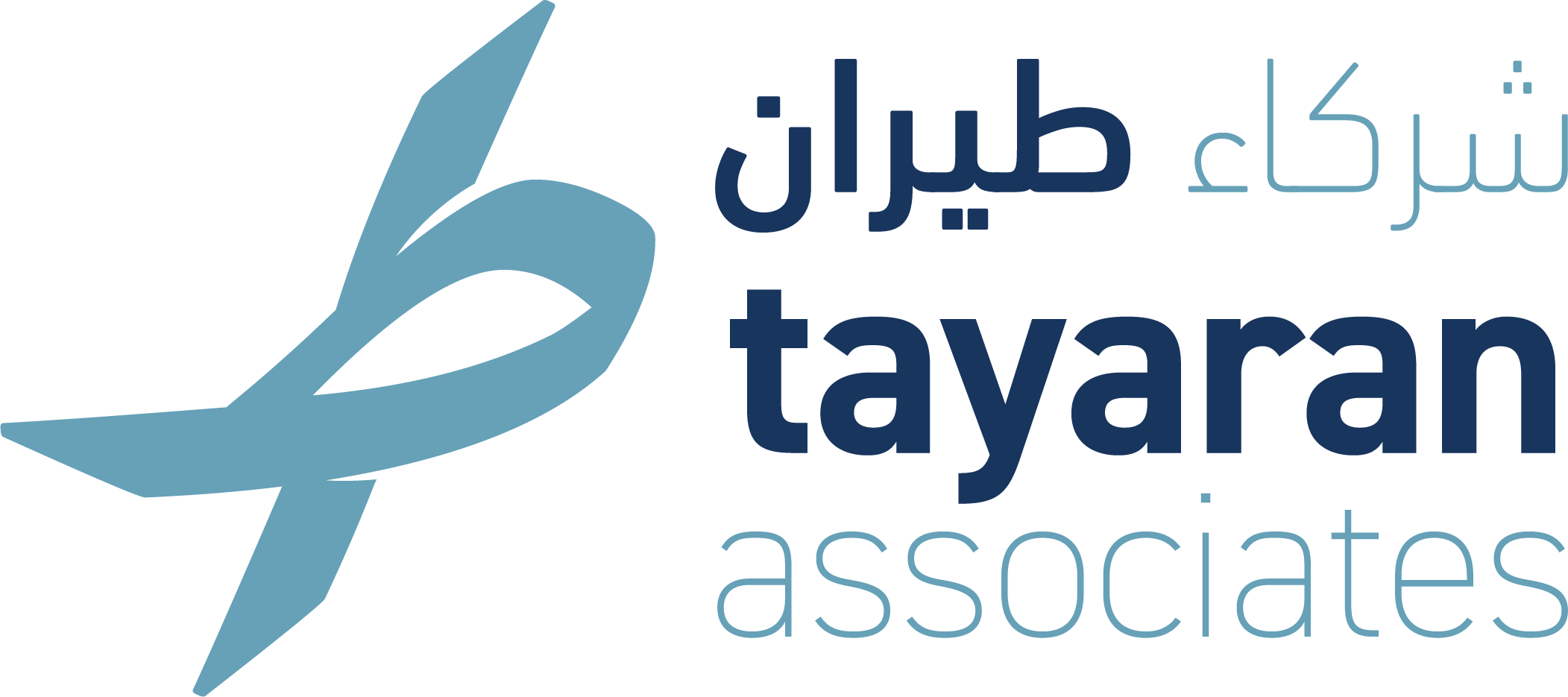
The Logo
The icon is then combined with the Arabic and English lockup for ‘Tayaran Associates’. Both wordmarks for ‘Tayaran’ are boldened for emphasis.
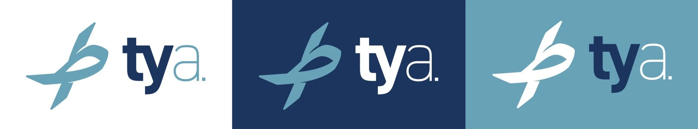
The logo also uses a shortened variant with just the company name’s initials.